Explore our Webflow Templates

Connect with Socials:


Explore our Webflow Templates
Connect with Socials:

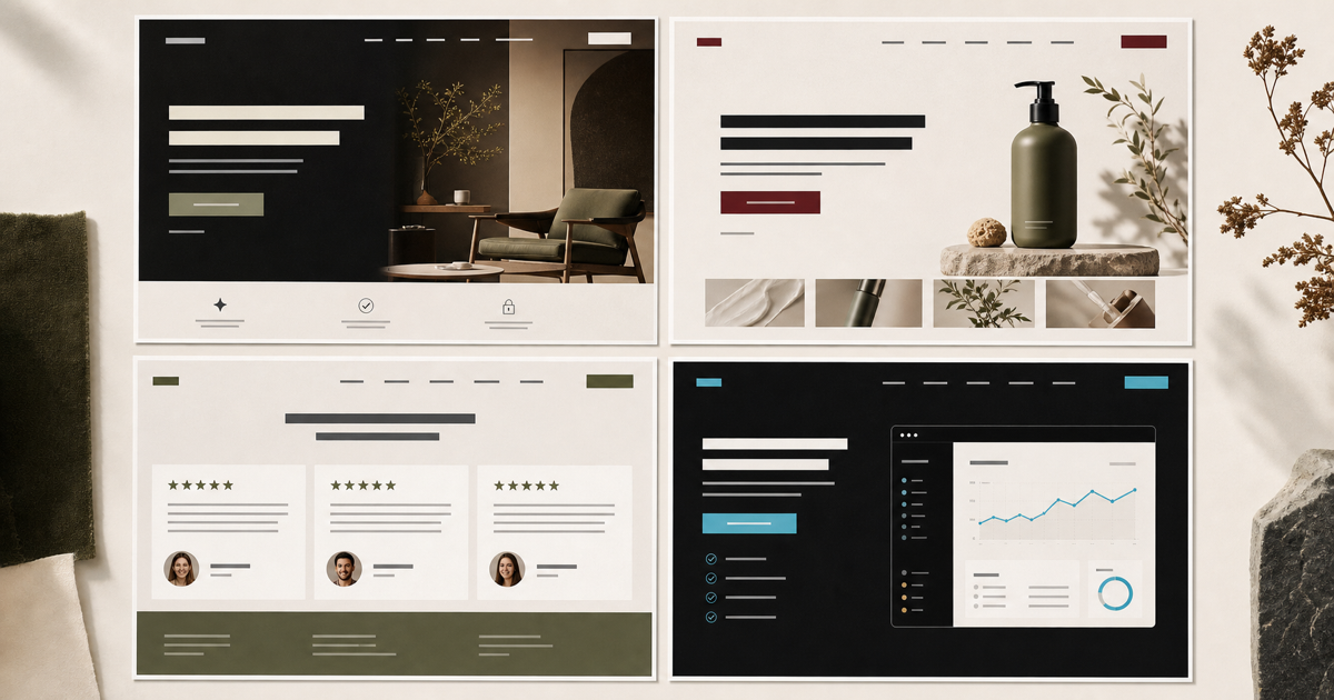
Ten Made in Webflow examples and the conversion-ready patterns to study, from focused heroes and proof to product demonstrations and disciplined next steps.
The examples below were selected from Webflow's public Made in Webflow showcase because each demonstrates a pattern worth studying. Inclusion is not proof of a measured conversion rate, and visual popularity is not the same as business performance. Treat this as design analysis, then validate patterns against your own users and analytics.
Do not copy a layout without its context. A portfolio, membership product, education platform, ecommerce page, and enterprise service have different questions and risk. Extract the principle, not the pixels.
Memberstack's Made in Webflow presence is a useful reference for a product-led marketing site. The pattern to study is progressive explanation: state the job, show the product and outcomes, address implementation concerns, then repeat a clear next step after the visitor has more context.
Conversion Examples presents case-study content about product psychology. Its useful lesson is format clarity: visitors should understand what they will receive and why it is distinct before browsing the archive. Content businesses convert when the library feels navigable rather than endless.
Enterprise technology sites need to communicate outcomes, integrations, security, and implementation without turning the homepage into documentation. UJET is a reference for using clear layers: lead with the operating value, establish category credibility, then route technical evaluators to deeper material.
Education products benefit from showing course structure, subject variety, instructor context, and progression. The Skillex example demonstrates how visual browsing can reduce uncertainty. A prospective learner should be able to imagine the experience before seeing a payment step.
A concept-heavy startup still needs ordinary clarity. The SION car-startup example is useful for studying how bold visual identity can coexist with familiar sections for benefits, product detail, proof, and action. Novel art direction should not require visitors to decode the navigation.
Agency and portfolio sites often show final images without revealing the decisions behind them. Moris Design Co. is a reference for creating a strong visual impression, but the conversion lesson is to connect imagery to services, role, constraints, and results so a buyer can judge fit rather than taste alone.
Distinctive agency sites can create recall, but personality should clarify who the agency is for. The Good Time Agency example supports a useful test: every expressive interaction should strengthen positioning, proof, or navigation. Remove effects that compete with the next step.
For a creator, the work itself is the highest-value evidence. Joseph Berry's music work illustrates the principle of bringing the core artifact forward instead of surrounding it with generic claims. Product, media, and portfolio sites should prioritize inspection before explanation when the artifact can carry trust.
Immersive experiences can earn attention when the story is the product. The Goonies is a long-standing Made in Webflow reference for narrative craft. Commercial teams should borrow its pacing selectively while preserving location cues, accessibility, performance, and a clear exit to the intended action.
Fintech and payment products need trust, specificity, and calm hierarchy. The PaymentX showcase example is useful for reviewing how brand and website design can make an abstract service tangible. Conversion still depends on explaining eligibility, workflow, risk, support, and the next step in direct language.
| Pattern | Visitor question | Implementation check |
|---|---|---|
| Focused hero | Is this relevant to me? | One primary audience, offer, and action above the fold |
| Product or work proof | Can they actually deliver? | Screens, case studies, demonstrations, or inspectable output |
| Progressive detail | What do I need to know next? | Information ordered by evaluation stage rather than internal departments |
| Specific credibility | Why should I trust this? | Named clients, outcomes, methods, authors, sources, and limitations |
| Repeated next step | What should I do now? | A consistent action after major decision sections |
| Fast stable delivery | Will this be frustrating? | Responsive media, restrained scripts, accessible controls, and stable layout |
Flowmarc uses references to establish ambition and interaction language, then returns to the client's positioning, evidence, content, constraints, and operating model. The result should feel native to the business, not assembled from recognizable showcase fragments.
Not automatically. Conversion depends on positioning, content, evidence, UX, performance, accessibility, traffic quality, and follow-up. Either platform can support a strong or weak result.
No. Study the principle and decision path, then adapt it to your audience, offer, evidence, brand, content volume, and technical constraints. Copying appearance does not copy context or results.
Use one clear primary action and repeat it where the visitor has enough context. Secondary actions are useful when audiences have genuinely different next steps, but competing choices can weaken clarity.
Animations can improve orientation, feedback, demonstration, and brand recall, but they can also delay content and harm accessibility or performance. Use motion only when it supports the visitor's task.
Test comprehension and usability before launch, then monitor task completion, qualified conversions, engagement with key proof, performance, and sales feedback. Compare changes against a baseline rather than assuming visual polish caused the result.


Thanks - your message is ready to send. We respond within 24 hours.